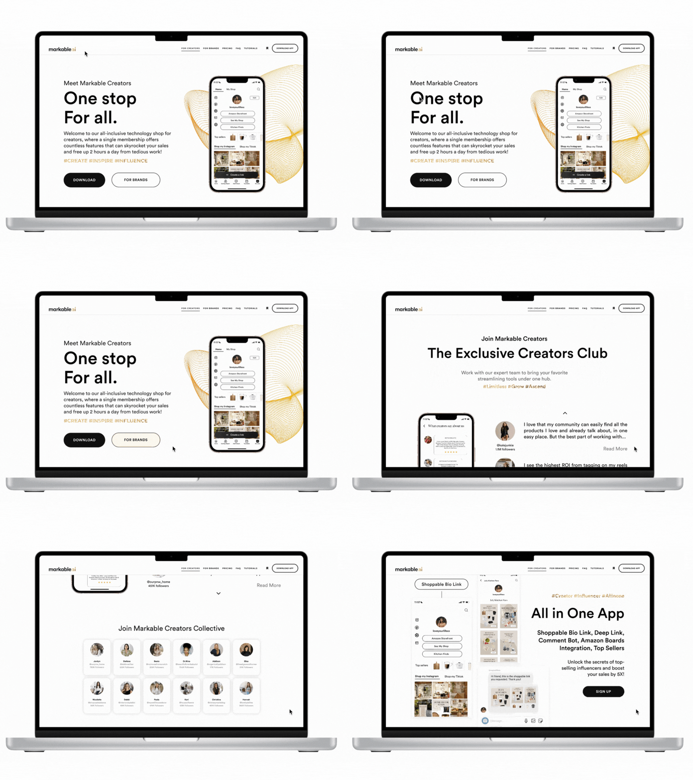
markable.ai Responsive Website Redesign
Boost Your Sales with a Click of a Button
Challenge: Redesign a responsive website landing page aimed to direct content creators towards signing up for markable.ai, formerly Markable Creators, a subscription-based technology service headquartered in Spokane, WA. The service seamlessly connects digital media content with e-commerce solutions.
Problem: The current website lacks compatibility with mobile devices and fails to reflect the company’s expanded range of services.
Timeline
September - November 2023 (Complete)
Roles
Lead UX/UI Designer, Researcher, UX Content Writer, Web Graphic Designer
Methods
Features Analysis, Competitive Analysis, Tree Testing, Design Studio, Wireframing, Prototyping, Usability Testing, A/B Testing
Tools
Figma, Notion, Keynote, Google Drive, Zeplin, Feishu, Adobe Creative Suite, Canva

Opportunity
A responsive landing page that provides
Overview of new & upgraded services
01
Personal/Brand sign-up options for content creators
02
Showcase of existing community at markable.ai
03


What we changed
✔ Information architecture (IA)
✔ Graphics of mobile app functions
✔ Interactive UI components
✔ Content copy for new features
▢ Company brand guidelines
Information Architecture
Navigation
We changed the wording “For Sellers” to “For Brands” to reduce confusion and differentiate between individual vs. brand e-commerce sellers.
We removed “News”, “Log in”, and “Sign Up” sections, and implemented “Pricing”, “FAQ”, and “Tutorials” to better fit the company’s new goal of helping content creators learn about our services.
Introducing the Native App
General
We redesigned the landing page with new graphics and copywriting to guide users to download the newly launched native app on their iOS devices.
Sign up Button
Two distinct buttons now cater to both individual sellers or brands. The “I’m a creator” button is now the “download” button, and the “I’m a seller” button is now the “For Brands” button.
Background
We transitioned from a subtle yellow gradient background to a clean, minimalist white backdrop to reduce visual clutter and maintains a playful atmosphere.
Explaining App Functions
General
We redesigned both the graphics and copywriting to align with the functions of our app. This involved listing the features and demonstrating the app's functionality with a preview of its capabilities.
Sign up Button
We reintroduced the "Sign up" button here to prompt users to download the app on their iOS devices with a single click.
User Interface
We maintained the white backdrop to minimize visual distractions, and prioritized graphics over text to create a clean and uncluttered interface. This design choice ensures that the visuals take center stage.
Mobile App Wireframes
We decreased the font size and redesigned the layout to accommodate mobile screens for users to easily locate our services and download the app. One challenge we encountered was maintaining legibility of the graphics for our millennial and Gen X target audience. To address this, we separated all graphics into individual sections to optimize spacing.
Typography Exploration
We explored alternative typefaces to improve the company’s website while maintaining consistency with the company's colors. We generated three different font combinations, and ultimately opted to stick with a single typeface, Circular Std.
Next Steps
Stay Tuned
🎉 More features on the website will be implemented with the development of the iOS app!
😉 Fun fact: I also served as a UI designer for the newly launched iOS app.
Reflection
This project provided me with firsthand experience collaborating with the front-end engineering team to implement new features on the company website. Initially, our team utilized Sketch for the website design, but for this redesign, we migrated all design files to Figma. To facilitate seamless access to the new brand guidelines for the China team, I translated the brand guidelines and design CSS into Mandarin. The website is now live on markable.ai. Check it out!


