Postal Petals Mobile App
Cultivating Wellness, One Arrangement at a Time
Challenge: Promoting wellness practices in the floral industry. The subscription based floral delivery service in LA, Postal Petals, wants to expand their market with a mobile app centered around floral arranging classes to promote the importance of wellness practices.
Problem: People don’t usually associate floral arranging as a form of wellness practices. Despite the significant market potential, there's a gap between floral arranging and its benefit to mindfulness and well-being, as the wellness industry valued at $450 billion and the floral market at $52.13 billion in the US.
Timeline
January - February 2024 (Complete)
Roles
Lead UX Designer, UX Researcher, UI Designer
Methods
Competitive Features Analysis, Screener Survey, User Interview, Affinity Mapping, User Persona, User Journey, Feature Prioritization, Design Studio, Style Guide, Wireframing, Prototyping, Usability Testing
Tools
Figma, Notion, Keynote, Google Spreadsheets, Google Forms, Zeplin, Zoom, Canva
Opportunity
A mobile app that includes
Interactive, user-centric guides & Real-time classes
01
Tailored audio education & wellness journey
02
Supportive and inspiring community network
03

Our Process
DISCOVERY
How have our users responded to the introduction of flower arranging as a relaxation technique?
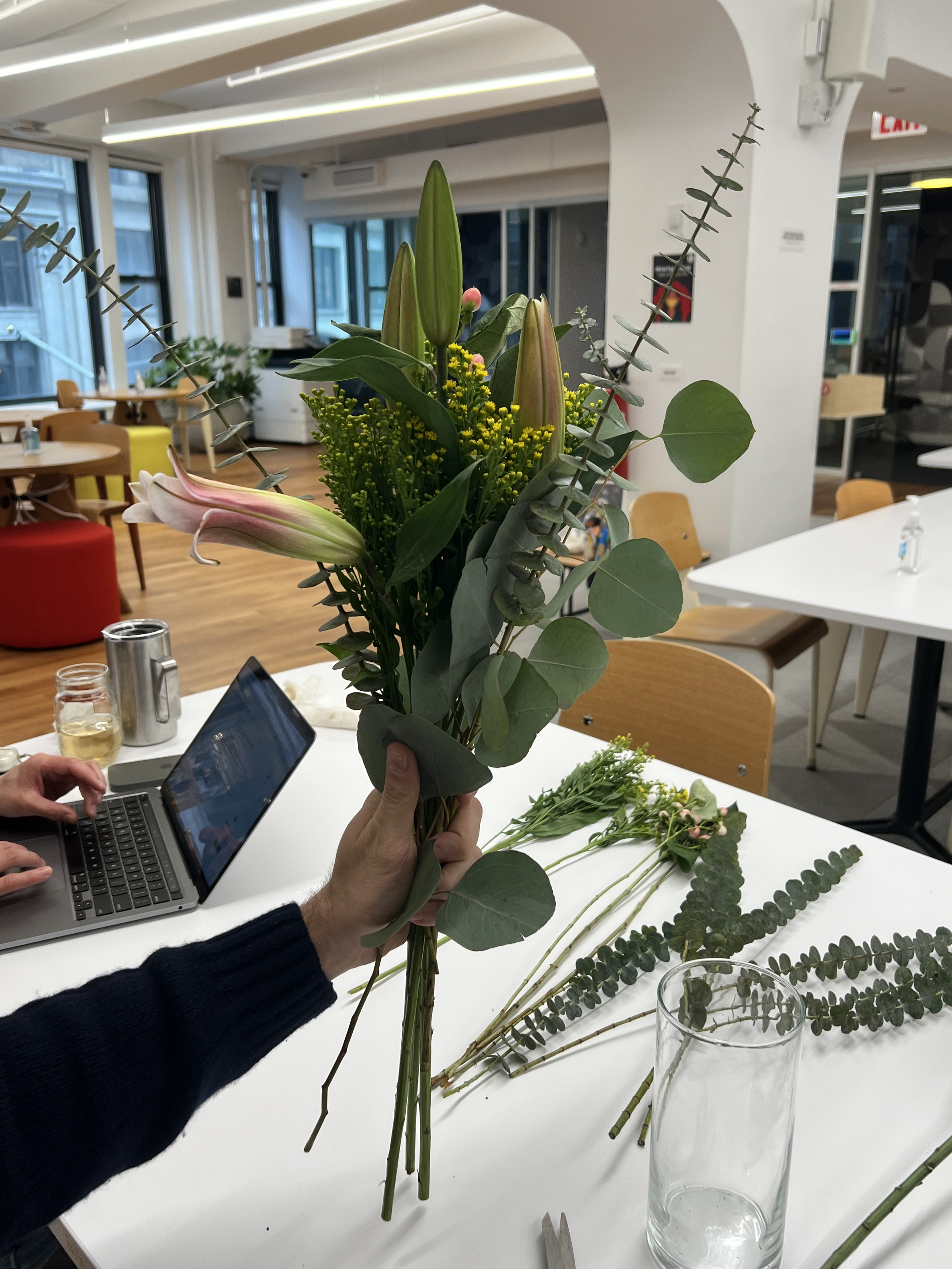
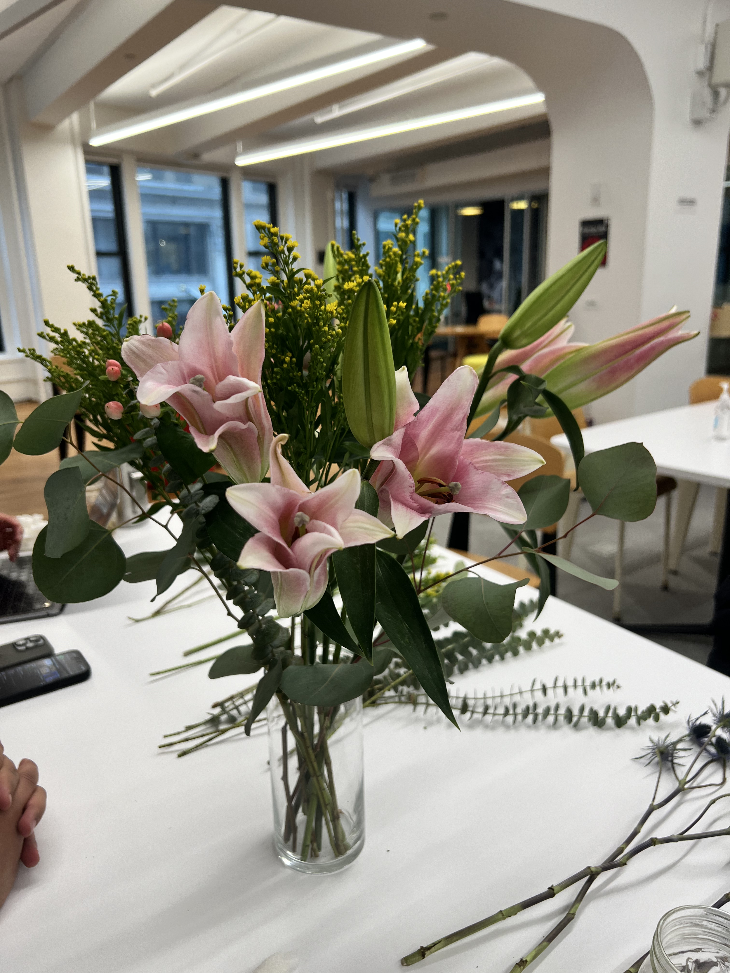
Our team invited several people to arrange the same set of flowers while listening to their music of choice. We assessed each participant’s mood before and after the activity, and here is what we discovered…
Fritz
Audio played: Instant Crush - Daft Punk
Mood before: “A little anxious”
Mood after: “Feels good”
Harry
Audio played: Flowers - Miley Cyrus
Mood before: “Okay”
Mood after: “Relaxed”
Izzy
Audio: Spotify Classical playlist
Mood before: “Very tired”
Mood after: “Excited. It smells good”
Arranging flowers helps to regulate stress ☺

Our team created this prompt after drawing the insight from above:
How might we offer wellness enthusiasts ways to express creativity as well as to enhance overall well-being?
SYNTHESIS
We hypothesized that connecting floral arranging with wellness practices like mindfulness and meditation not only closes industry divides but also highlights its therapeutic advantages in mental health.
From our problem space, we made some assumptions
▢ Individuals have diverse approaches to wellness practices
▢ Floral arrangement with intention can promote wellness
▢ Individuals want to integrate wellness practices daily
▢ Learning new wellness techniques can lead to enjoyment
To clarify our research scope, we crafted a
Competitive Analysis
We explored what other floral delivery brands provided to assess existing competitor offerings and identify gaps.
Our team identified potential opportunities where Postal Petals could improve on to create a better experience than their competitors.
0%
here’s what we found
14%
Wellness Focus
Postal Petals is the only company that has a focus on wellness
Mobile App
The majority of competitors do not have mobile apps
43%
Live Classes
Competitors have an online shop but none offer live classes
To validate our hypothesis, we conducted
11 Interviews
with individuals who passed our screener survey that actively practice wellness as a part of their daily routine or users who purchase, receive, and/or arrange flowers.
From our user research, we validated our
Assumptions
✔ Individuals have diverse approaches to wellness practices
✔ Floral arrangement with intention can promote wellness
✔ Individuals want to integrate wellness practices daily
▢ Learning new wellness techniques can lead to enjoyment
We found that users want
Seamless Integrate Wellness into busy schedules on a day-to-day basis as a healthy routine.
Accountability and Flexibility in guided wellness sessions as well as the opportunity to express creativity.
Efficient Learning such as tutorials segmented into labeled sections for easy navigation without rewatching familiar content.
Organized Wellness that allows to easily integrate class schedules into their calendars.
Customized Audio Preferences during wellness routines such as meditations and physical workouts.
Persona
To guide our user needs, we created a
Designing a persona gave my team a clearer visualization of who we aimed to design our product for by identifying the user’s goals, needs, and frustrations.
User Journey
To explore opportunities, we crafted a
02
01
03
Pain Points
01
The abundance of flower choices is overwhelming
Reading through flower arranging guides is tedious
02
Matching instructor audio with music is difficult
03
IDEATION
We prioritized most-needed features
01
02
03
04
05
06
Account login page
Customizable audio/video player
Live class scheduling
Tutorials page
Tutorial filters
Our team ideated 27+ features and organized our ideas into categories ranging from "essential" to "nice to have" and from "low effort/expense" to "high effort/expense." This method allowed us to evaluate the importance of each feature within the constraints of budget and workload across various teams.
Profiles page
DESIGN
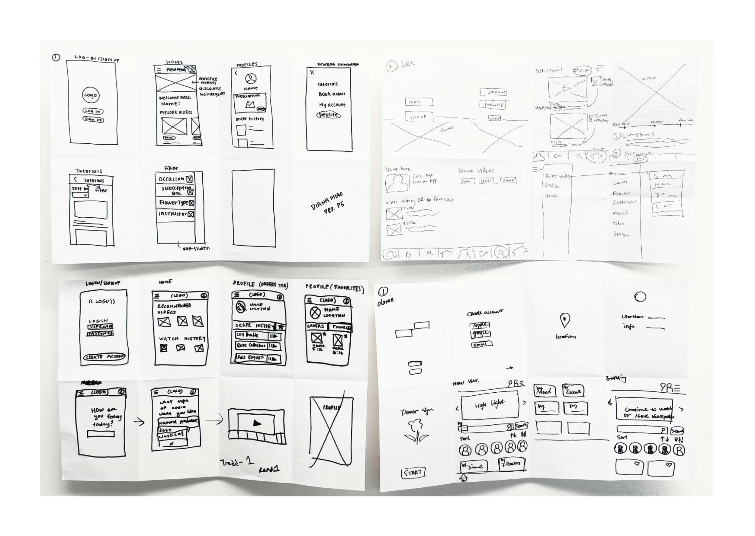
We made initial sketches
and turned them into
Mid-fidelity Wireframes
and last but not least,
High-fidelity Wireframes
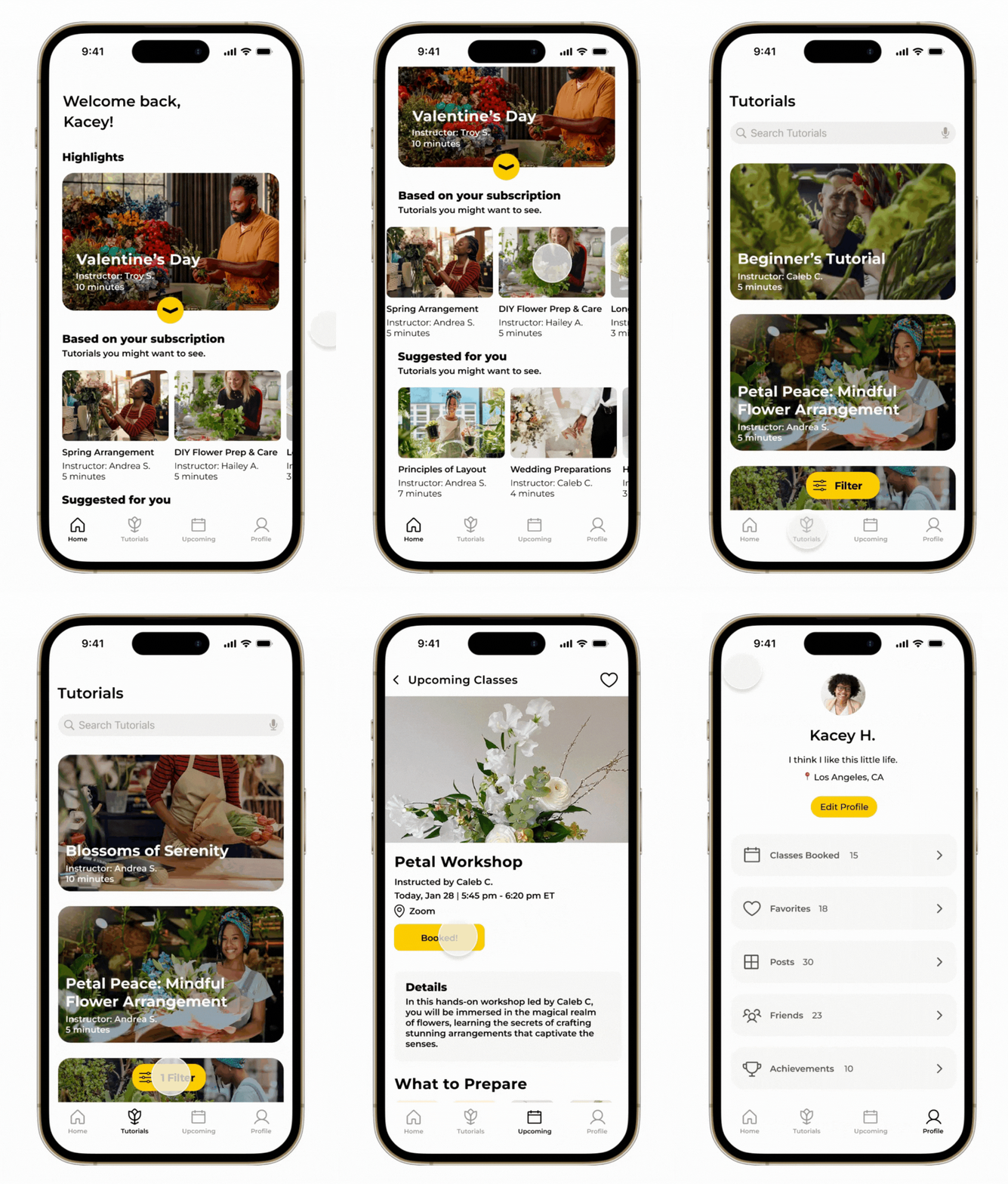
Our team created high-fidelity wireframes after the first round of usability testing to address blockers and enhance the overall user experience based on data. We also implemented a consistent design system for cross-functional teams to utilize. Then, we translated the wireframes and user flows into readable CSS using Zeplin.
Users were confused about which video to click on after scrolling
Success Rate: 75%
Time on Task: 13 Secs
Easiness Rating: 4/5
After designing wireframes, we built our mid-fidelity prototype and conducted usability testing to uncover areas of confusion. Then, we redesigned certain aspects within the prototype in high-fidelity and conducted a second round of usability testing to validate our design decisions. Below are the results!
We changed “Suggested for you” to “Based on your subscription”
Success Rate: 95% ✔
Time on Task: 20 Secs ✔
Easiness Rating: 4.7/5 ✔
Task 1: Check details and start Valentine’s Day tutorial
Usability Testing
To assess our product's usability, we underwent two rounds of
Users were confused to which button to click on due to the placement of icons
We positioned the "full screen" icon at the bottom and refreshed the colors
Task 2: Adjust the instructor’s audio volume
Success Rate: 95%
Easiness Rating: 4/5
Time on Task: 17 Secs
Success Rate: 100% ✔
Time on Task: 13 Secs ✔
Easiness Rating: 4.7/5 ✔
Users found certain filter words confusing to understand and navigate through
We split the "Vase Type" filter into two sections and clarified "Length" and "Flower Type"
Task 3: Search classes by filter
Success Rate: 85%
Easiness Rating: 4.3/5
Time on Task: 18 Secs
Success Rate: 95% ✔
Time on Task: 9 Secs ✔
Easiness Rating: 4.8/5 ✔
Users were uncertain if they had already booked all the upcoming classes shown.
Task 4: View and book today’s upcoming classes
We introduced the "Booked" icon to remind users of their booking.
Success Rate: 95%
Easiness Rating: 4.7/5
Time on Task: 13 Secs
Success Rate: 95%
Time on Task: 8 Secs ✔
Easiness Rating: 4.9/5 ✔
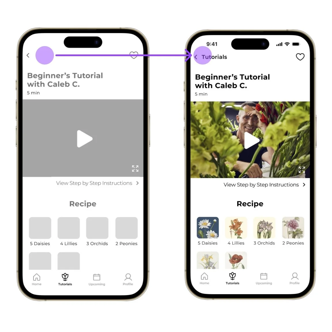
Users found it challenging to remember what the back button would lead to
I included the term "tutorials" to inform users of the tab they're viewing
Task 5: Select a tutorial suited for first-time floral arranging
Success Rate: 90%
Easiness Rating: 4.4/5
Time on Task: 15 Secs
Success Rate: 95%
Time on Task: 11 Secs ✔
Easiness Rating: 4.5/5 ✔
DELIVERY
We created our high-fidelity prototype!
Video Player Screens
Scroll for horizontal screens
⇣
To keep brand consistency, we created a
Style Guide
After analyzing the existing website, we adjusted the primary colors of the mobile app to be the secondary colors of the original website branding, as the bright yellow could be overwhelming. As a result, we established a clean style guide specifically tailored to the mobile app.
To make the app fun and inviting, we made
Interactive Components
Our team wanted the user experience to be therapeutic, fun, and inviting, which led us to design minimalistic, bright interactive UI components based on the typeface and color scheme from the brand guidelines.
Meet my teammates!
Before you go, we would love to tell you about our
Next Steps
Feature Recommendations
Increase styling in filters section with icons
Revise button labels, particularly on the Login screen; contemplate swapping "Login" with "Let’s Go" or "Enter"
Style logistical booking details for live classes; e.g., calendar integration, shared Zoom links
Develop a "watch party" feature for simultaneous remote tutorial viewing by multiple users
Video Content Suggestions
We came across a number of insights in our user interviews that are more applicable to tailoring content than UX Design.
Reframe content toward wellness by beginning each video with a mindful intention or reference to feelings
Videos for tips about purchasing your own flowers
Audio only options, including step-by-step photos of each arrangement
